Text: Maru Hautala, Interior Designer at Nionio
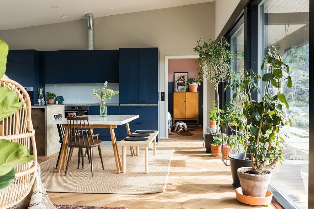
A colourful interior adds personality to a log home and bolder tones are sure to catch the eye in interiors. Log surfaces are usually left in fairly natural tones, but bolder colours can easily be added to flat wall surfaces.
Which shades go together with logs, and how can you choose reliable shades that will last? This post includes user-friendly tips on tones suitable for log homes – in something other than the usual grey or white.
 Trusty green
I prefer tinted colours, which tend to be gentler on the eye, in log-home interiors. A tinted shade is created when a complementary colour or a dash of grey is added. The resulting tones are often described as earthy. Tinted, earthy tones are great are favored in the Nordics, where light enters buildings at a fairly low angle most of the time. In addition, logs have natural shades which typically go together with tinted colour palettes.
Green tints tend to grow on people who are not normally fans of colour. Wonderful greens suitable for log houses include the Tikkurila shades Arctic Willow M495, Serpentine V447 and, at the darker end with tints of blue, Nephrite N494. Green shades are easy to combine with other topical tones for interiors, such as light pink, delicate lilac or various shades of beige.
 Intense blue
A slightly hazy blue is sure to please in interiors and goes perfectly with different shades of brown. Tikkurila’s Rain J490 is an example of a hazy, grey-blue tone.
You can also choose a deeper and much darker shade of blue, such as Denim N429, for bedrooms. On the other hand, the trend-conscious might opt for the light blue and fresh Cumulus 354, colour of the year on the blue palette. This tone is easy to brighten up with, say, yellow furniture and lighting.
Nude or plain brown?
Nude and rose shades have been trendy for a while. Brick reds were also rising in popularity a few years ago, but hardly any made it into Finnish homes, although darker brownish shades also go beautifully with white furniture and light log surfaces. Be bold when applying dark shades to walls — compared to the colour chip, the tone always lightens a few degrees on large surfaces.
If you paint plasterboard walls in a brown shade, I recommend treating the log surfaces with either translucent white, which eliminates yellowing, or a white coat of paint. A yellowish log is not the best match for the tones in question.
Nude tones work beautifully, especially in children’s rooms, and are likely to last even as children grow. See the beautiful nude tone, Tikkurila V473. However, a reasonably subdued brown can serve as an intense shade. For example, shade V471 (the darkest) of the Tikkurila colour V472 provides a good frame for grey and white furniture.
 A colour palette for an entire house
There is no law against giving logs a coloured coat of paint. However, make sure that the paint does not prevent the logs from breathing. The shades featured in the post also work beautifully together — choose one suitable for every room in the house: Soothing green for large living room surfaces, soft blue for bedrooms and a long-lasting nude tone for children’s rooms.
There has been a gradual shift from individual textured surfaces to broader shade selections, so I recommend using colour paints on more than one wall. For example, treat bedroom log walls with one shade and panel walls with another. Restricting yourself to two shades in a small room keeps the overall look under control and the ambience tranquil.
Get inspired by these articles!
How can we help you?
Share your log home dreams with the nearest Honka representative. We will help you to realise them.
Get in touch


